


Iterations
———


ROB Movement & Transformation
———
I redesigned the “ROB Movement” and “Transformation” data from a graph-based format to a card-based layout, as users found it challenging to analyse vessel-level data through multiple graphs. By introducing a consolidated view across all vessels, I improved data clarity while still enabling access to detailed insights within individual vessel cards.
Given the importance of this data across user groups, I prioritised its placement at the top of the layout to ensure immediate visibility and accessibility.

Critical Spares
———
Through discussions with superintendents and procurers, I identified that presenting only critical spares data was insufficient, as users frequently needed access to related procurement information. To improve usability, I introduced a consolidated vessel-level view of “In Progress” and “Pending Delivery” data, along with a “Raise Request” CTA to streamline actions.

Financial Data
———
Superintendents were spending significant time manually gathering financial data from multiple sources (POs, invoices, etc.) and compiling it in MS Excel to analyze vessel-level spending. However, this data already existed within the Propeller database.
To eliminate this inefficiency, I introduced a “Cost Overview” section on the landing page, providing a centralized view of financial data and enabling faster, more informed decision-making.

AI Recommended Insights
———
Although the data was available, it was highly fragmented. To unlock its value, we explored an option of using AI to analyze the data and generate meaningful, business-relevant insights. This led to the introduction of a dedicated section where AI-driven recommendations surface key insights for users.

Fixing Top Navigation
———
We have feature "Selection of Vessels" & data point "Last Import timestamp" which are constant through out the dashboard and all data & features are dependent on these, So decided to have them inside "Top Navigation" to give a sense of highest importance to the user.


Goal 1: Test whether users are able to “Scan & Understand” the landing page.
Goal 2: Test whether users are able to read “Transformation status & ROB Movements”.
Goal 3: Test whether users are able to “Rise Req” for procurement of “Critical Spares”.
Goal 4: Test whether users are able to understand “Insights & Opportunities” generated with AI.
Goal 5: Test whether users are able to “Share & Download” the reports from the landing page.
5/5 - Completed scanning & understanding of landing page.
5/5 - Completed reading of transformation & ROB Movement.
3/5 - Requested to remove “Rise Req” CTA, Since “Standard Operating Procedure” has changed.
2/5 - Said that need share and download features for PO Overview and need more simple UI.
5/5 - Said they liked the over all experience and its easy to navigate and understand.
Key Takeaways
3/5
Requested to remove “Rise Req” CTA, Since “Standard Operating Procedure” has changed.
Remove “Rise Req” CTA from the card and make critical spares more simplified and detailed.
2/5
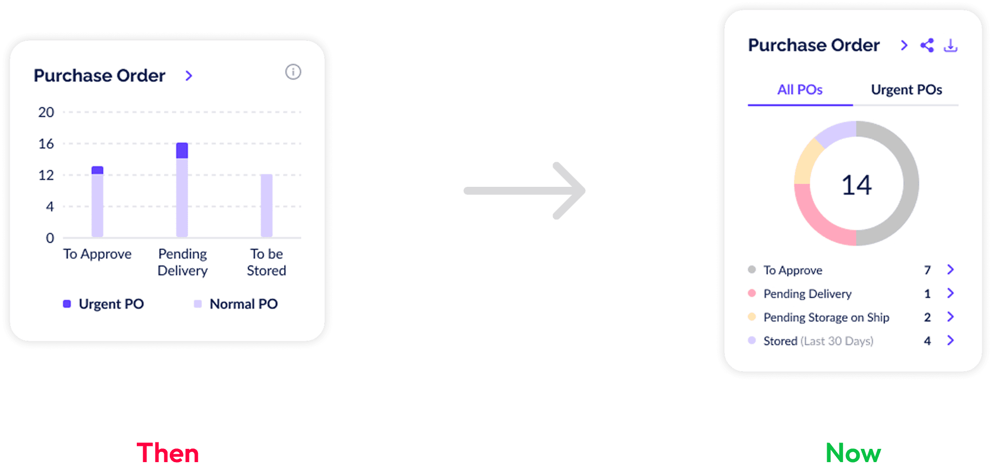
Said that need share and download features for PO Overview and need more simple UI.
Redesign “PO Overview” visual card and provide share and download option for PO Reports.

60%
Increased work efficiency across all the operations

Enabled proactive budget control with clear spend vs. allocation insights across vessels and saved billions of dollars till date.
50%
Improved decision making speed by cutting down data consolidation time from 48hours to instant access.
Back to Top
Next Project