Reducing Friction in the Konnectbox
Checkout Experience

Quick Summary with Final Prototype Video
———
Quick Summary with Final Prototype Video
———
Quick Summary with Final Prototype Video
———
Problem: A lengthy, multi-step checkout journey overwhelmed users, created unnecessary friction, and contributed to lost revenue.
Action: Streamlined the checkout experience by eliminating redundant screens and unnecessary verification steps, making the journey faster and more intuitive.
Outcome: Increased application adoption by 28% through a streamlined, frictionless checkout experience.
Impact: Reduced task completion time by 35% and support tickets by 25%, creating a smoother checkout experience with fewer user pain points.
Problem: A lengthy, multi-step checkout journey overwhelmed users, created unnecessary friction, and contributed to lost revenue.
Action: Streamlined the checkout experience by eliminating redundant screens and unnecessary verification steps, making the journey faster and more intuitive.
Outcome: Increased application adoption by 28% through a streamlined, frictionless checkout experience.
Impact: Reduced task completion time by 35% and support tickets by 25%, creating a smoother checkout experience with fewer user pain points.

Overview
———
Overview
———
Overview
———
Product
Product
KB Customer Application
KB Customer Application
Type
Type
B2B E-Commerce
iOS, Android & Web App
B2B E-Commerce
iOS, Android & Web App
My Role
My Role
As the Product Designer on this project, I helped build the application from scratch. I worked closely with our Design Head to lay down the basic blueprint—mapping out the site structure, information architecture, and core user flows. Along with designing key parts of the experience myself, I guided two UI designers on the team to make sure everything felt cohesive and worked seamlessly across the entire app.
As the Product Designer on this project, I helped build the application from scratch. I worked closely with our Design Head to lay down the basic blueprint—mapping out the site structure, information architecture, and core user flows. Along with designing key parts of the experience myself, I guided two UI designers on the team to make sure everything felt cohesive and worked seamlessly across the entire app.
Company
Company
KonnectBox
Bangalore, Karnataka (IND)
KonnectBox
Bangalore, Karnataka (IND)
Timeline
Timeline
3 Weeks
3 Weeks
The Team
The Team
Product Designer - 1
UI Designers - 2
Product Manager - 1
Frontend - 2
Backend - 1
DevOps - 1
Data Engineering - 1
Product Designer - 1
UI Designers - 2
Product Manager - 1
Frontend - 2
Backend - 1
DevOps - 1
Data Engineering - 1
Meet My Team
———
Meet My Team
———
Meet My Team
———
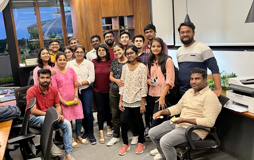
Let's start by understanding the basics of the project.
Let's start by understanding the basics of the project.
Let's start by understanding the basics of the project.
About
Konnectbox
———
About
Konnectbox
———
About
Konnectbox
———
Konnectbox is a B2B marketplace built to connect manufacturers, wholesalers, and retailers across India. It helps retailers and store owners discover products from suppliers beyond their local markets, giving them access to a wider selection and competitive pricing. For manufacturers and wholesalers, the platform creates opportunities to reach new markets, connect with more retailers, and expand their business beyond traditional local networks.
Konnectbox is a B2B marketplace built to connect manufacturers, wholesalers, and retailers across India. It helps retailers and store owners discover products from suppliers beyond their local markets, giving them access to a wider selection and competitive pricing. For manufacturers and wholesalers, the platform creates opportunities to reach new markets, connect with more retailers, and expand their business beyond traditional local networks.

Understanding the User
———
Understanding the User
———
Understanding the User
———
The primary users of Konnectbox are wholesalers and retailers who run independent businesses in local markets. Their businesses depend on consistently sourcing the right products at competitive prices and reselling them to retailers or end customers while maintaining a healthy profit margin.
Most of these business owners have built their businesses around strong local supplier networks. They often rely on personal relationships, phone calls, referrals, and established contacts to discover products, negotiate prices, place orders, and manage their supply.
The primary users of Konnectbox are wholesalers and retailers who run independent businesses in local markets. Their businesses depend on consistently sourcing the right products at competitive prices and reselling them to retailers or end customers while maintaining a healthy profit margin.
Most of these business owners have built their businesses around strong local supplier networks. They often rely on personal relationships, phone calls, referrals, and established contacts to discover products, negotiate prices, place orders, and manage their supply.

Now, Lets understand the issue.
Now, Lets understand the issue.
Now, Lets understand the issue.
The Checkout
Problem
———
The Checkout
Problem
———
The Checkout
Problem
———
Customers were dropping off during the checkout journey because the process was lengthy, time-consuming, and required too much effort to complete.
The existing flow consisted of multiple screens, with each screen presenting a significant amount of information for users to process at once. For newly onboarded customers, the additional requirement to provide and verify GST/Udyog Aadhaar details added another layer of complexity to the checkout experience.
The combination of information-heavy screens, multiple steps, and time-consuming verification made the process feel overwhelming and frustrating for customers. This increased the effort required to complete a purchase and contributed to checkout abandonment.
Customers were dropping off during the checkout journey because the process was lengthy, time-consuming, and required too much effort to complete.
The existing flow consisted of multiple screens, with each screen presenting a significant amount of information for users to process at once. For newly onboarded customers, the additional requirement to provide and verify GST/Udyog Aadhaar details added another layer of complexity to the checkout experience.
The combination of information-heavy screens, multiple steps, and time-consuming verification made the process feel overwhelming and frustrating for customers. This increased the effort required to complete a purchase and contributed to checkout abandonment.
What users told us
———
What users told us
———
What users told us
———
Users weren't just frustrated by the number of steps—they were concerned about how the additional time and effort affected their ability to complete sales.
Users weren't just frustrated by the number of steps—they were concerned about how the additional time and effort affected their ability to complete sales.

Mapping Friction Points
———
Mapping Friction Points
———
Mapping Friction Points
———
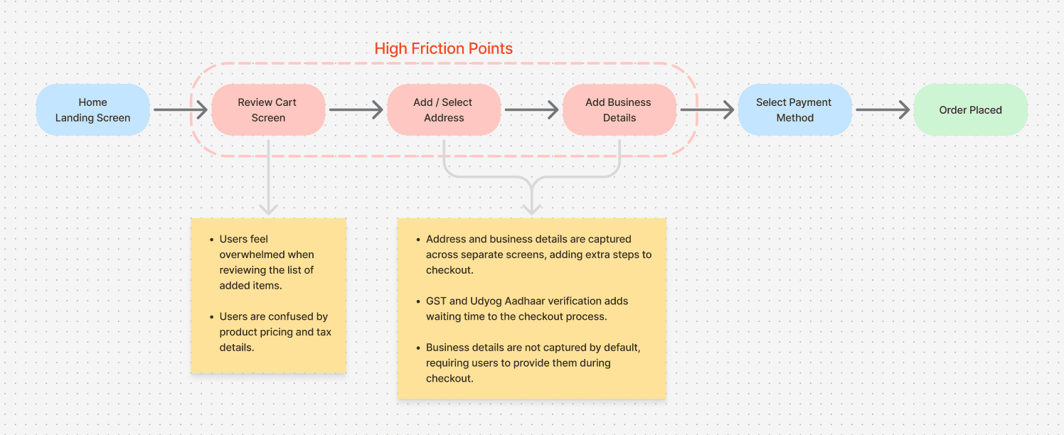
To better understand the checkout issues, I mapped the high-level user flow and identified the key points of friction highlighted by users and sales executives. I then walked through the entire flow myself to experience these pain points firsthand, helping me identify opportunities to simplify the journey and explore potential solutions.
To better understand the checkout issues, I mapped the high-level user flow and identified the key points of friction highlighted by users and sales executives. I then walked through the entire flow myself to experience these pain points firsthand, helping me identify opportunities to simplify the journey and explore potential solutions.
Key Friction Points
———
Key Friction Points
———
Key Friction Points
———
A lengthy checkout journey with too many screens and interactions.
Information overload makes it difficult for users to quickly understand and review their order.
GST / Udyog Aadhaar verification creates additional friction at checkout.
Repetitive actions and data entry make order completion time-consuming.
Newly onboarded customers experience a higher cognitive load due to the amount of information required.
The overall flow makes it difficult for users to complete their purchase efficiently.
A lengthy checkout journey with too many screens and interactions.
Information overload makes it difficult for users to quickly understand and review their order.
GST / Udyog Aadhaar verification creates additional friction at checkout.
Repetitive actions and data entry make order completion time-consuming.
Newly onboarded customers experience a higher cognitive load due to the amount of information required.
The overall flow makes it difficult for users to complete their purchase efficiently.
A lengthy checkout journey with too many screens and interactions.
Information overload makes it difficult for users to quickly understand and review their order.
GST / Udyog Aadhaar verification creates additional friction at checkout.
Repetitive actions and data entry make order completion time-consuming.
Newly onboarded customers experience a higher cognitive load due to the amount of information required.
The overall flow makes it difficult for users to complete their purchase efficiently.
User
Persona
———
User
Persona
———
User
Persona
———
To make sense of our usability testing and customer feedback, I created a user persona alongside a user journey map. Observing users try to find products and complete their purchase helped me trace their exact emotional highs and lows throughout the task. By mapping this experience, I was able to pinpoint critical friction points in the checkout flow and ground our redesign decisions around real user needs and pain points.
To make sense of our usability testing and customer feedback, I created a user persona alongside a user journey map. Observing users try to find products and complete their purchase helped me trace their exact emotional highs and lows throughout the task. By mapping this experience, I was able to pinpoint critical friction points in the checkout flow and ground our redesign decisions around real user needs and pain points.


Competitors
Study
———
Competitors
Study
———
Competitors
Study
———
Lets understand what other major players are doing when it comes to business. I have studied and analyzed Bijnis, Udaan, Ajio Business, Indiamart, Amazon Business, and Ali Express.
Lets understand what other major players are doing when it comes to business. I have studied and analyzed Bijnis, Udaan, Ajio Business, Indiamart, Amazon Business, and Ali Express.


The Solution
Strategy
———
The Solution
Strategy
———
The Solution
Strategy
———
01 — Simplify the Order Review
Reduce unnecessary product information and make pricing, tax, and total cost easy to understand.
02 — Verify Before Checkout
Move GST / Udyog Aadhaar verification to onboarding so checkout starts with verified business information.
03 — Reuse Verified Information
Use the verified billing address as the default shipping address and only ask users to provide additional information when necessary.
01 — Simplify the Order Review
Reduce unnecessary product information and make pricing, tax, and total cost easy to understand.
02 — Verify Before Checkout
Move GST / Udyog Aadhaar verification to onboarding so checkout starts with verified business information.
03 — Reuse Verified Information
Use the verified billing address as the default shipping address and only ask users to provide additional information when necessary.
Final Design
———
Final Design
———
Final Design
———

High - fidelity Prototype
———
High - fidelity Prototype
———
High - fidelity Prototype
———

Thanks for exploring this case study.
Ready for the next project?
———
Thanks for exploring this case study.
Ready for the next project?
———
Thanks for exploring this case study.
Ready for the next project?
———
Back to Top
Next Project